

ADD BUTTON
FINDABILITY
Improved report element adding: enhanced add button visibility and accessibility via UX best practices.
INTRODUCTION
Adding a new element to a Swydo report is one of the most basic, frequent actions in the builder — but in the previous design, the add button was only visible when hovering an existing widget, making it hard to find, especially on an empty report.
The goal of this project was to make adding a widget easy to discover, at every point in the report.
PROJECT
I benchmarked how other builder tools (Semplice, Squarespace) handle the same problem, explored several directions building on Squarespace’s pattern of showing available space between elements, and landed on a solution closer to the original add button customers already recognized — just repositioned and always visible, including horizontal and vertical gutter variants and a dedicated behaviour for tall widgets.
CHALLENGE
Customers were already used to the existing add button, so the challenge was improving its visibility and placement without breaking that familiarity — including edge cases like an empty report, adding between widgets in a row, and long, scrollable widgets where the button needed to stay anchored and predictable.
MY ROLE
I worked as the Product Designer on this project, running the competitive research, exploring UX directions, and designing the final add-button placement and its states across the report builder.
Old add button

The add button in the previous report structure was visible only when a widget in the report was hovered. Users were struggling with two main issues:
- Understanding where the add button functionality was located;
- Defining where the new widget would have been placed after the setup of the widget;
With these two main issues in mind, I was able to narrow a bit the process of what I wanted to achieve and where to go and make some research.
UX RESEARCH
I based my research on three different products:
- Semplice
- Squarespace
SEMPLICE
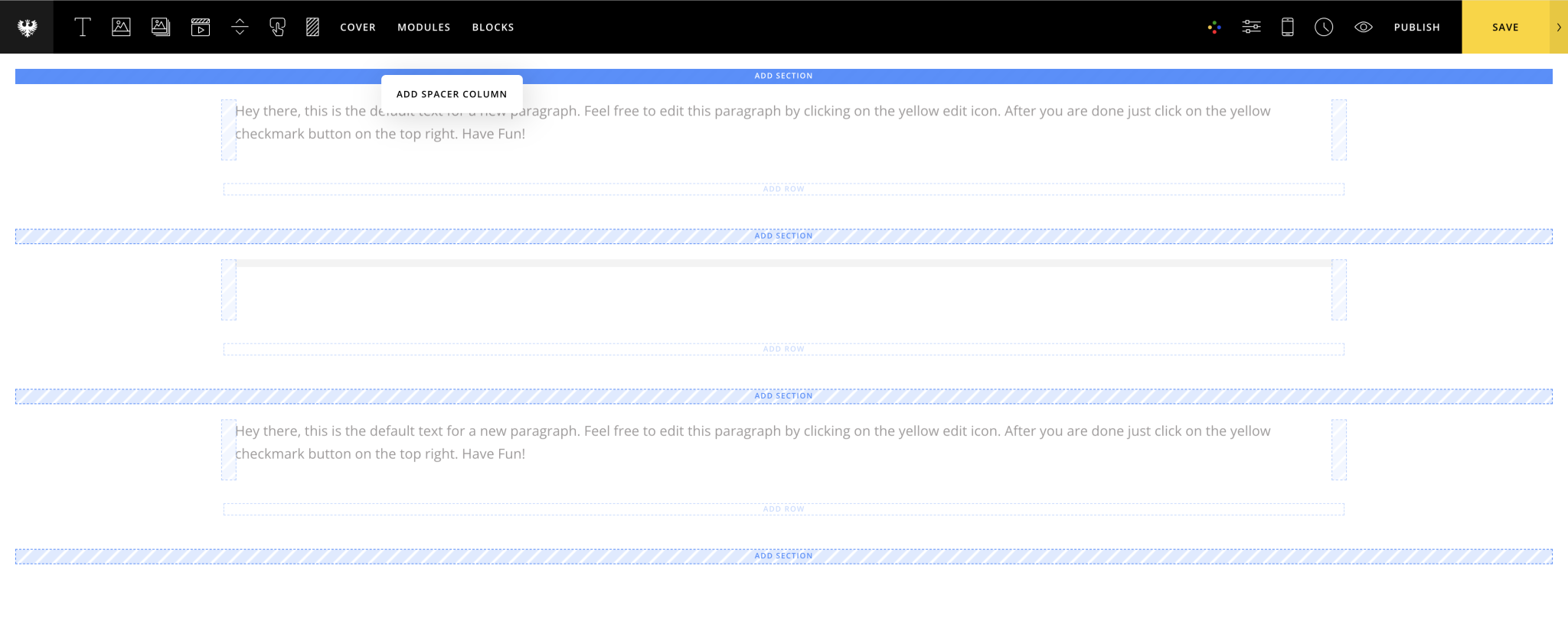
Semplice is a template for portfolios made in WordPress. Its editor is designed in a way that users can pull in the blank space in every kind of element they desire on the page, such as text blocks, images, videos, and so on.
When the user tries to insert an element in the page, the available destination spaces where the user can drop this element get highlighted. Once the user hovers over one of these areas, that signifier becomes active, showing to the user that if he now drops the element in there, the latter will be placed in the desired position.
SQUARESPACE
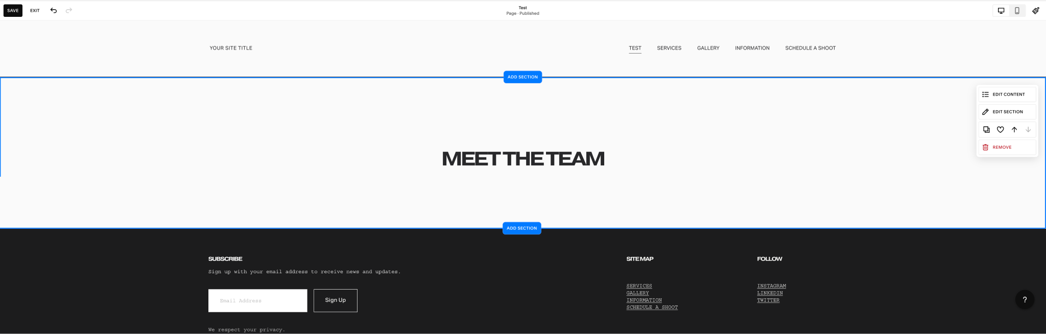
Squarespace behaves similarly to Semplice, but it has an interesting feature that was relevant to my research. When hovering over a section, two signifiers above and below the specific section are turned active, and the user can click on the "Add Section" button and add elements from there.
This was a useful use case because, in the report builder, users want to decide where to add their widgets, text editors or page breakers.
UX EXPLORATION
Given the examples found on the benchmark platforms, I started creating possible solutions for our product.
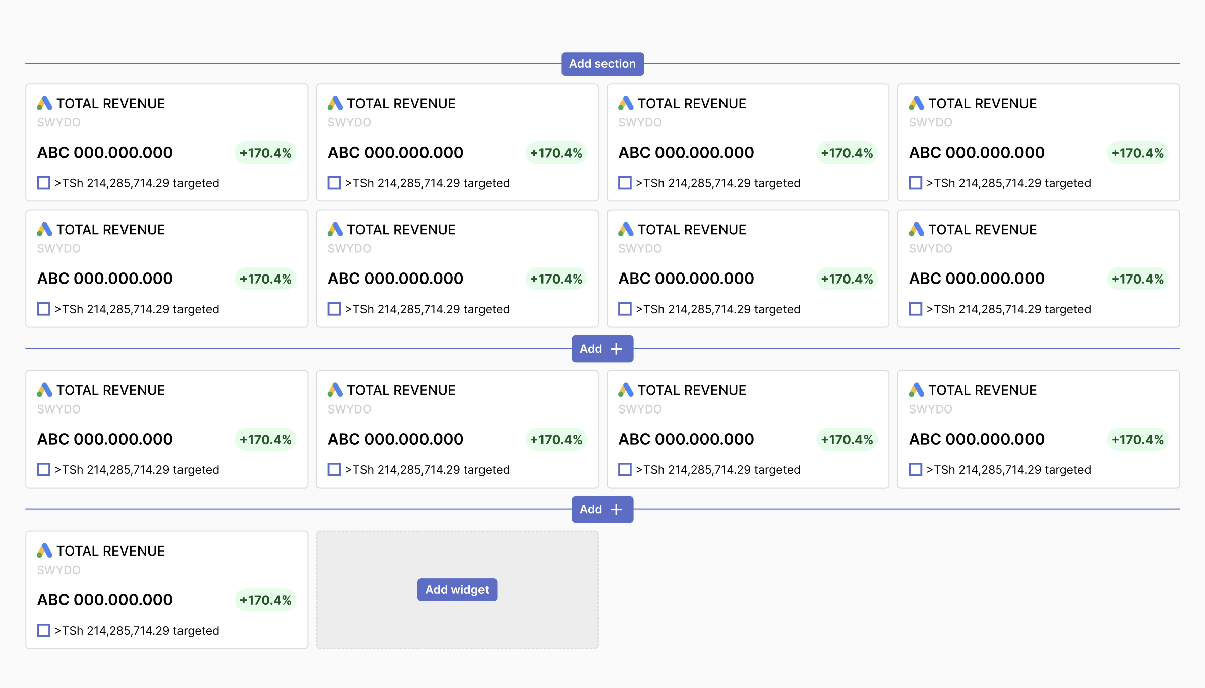
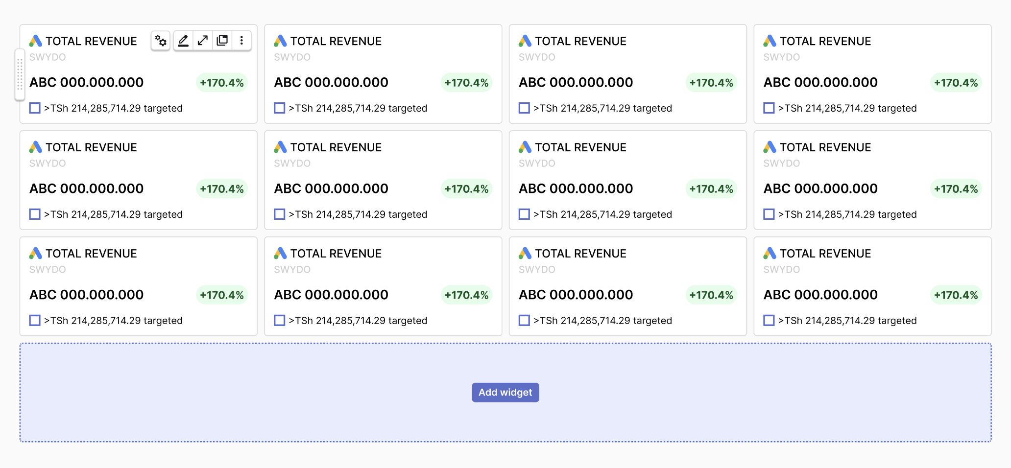
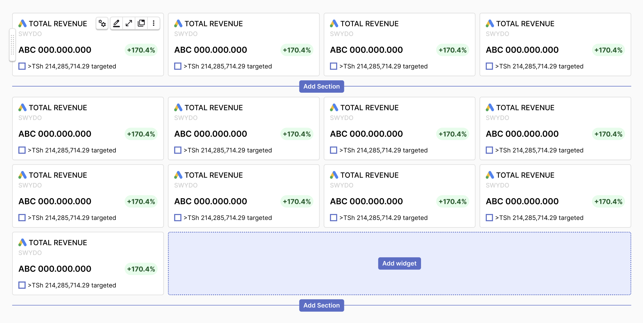
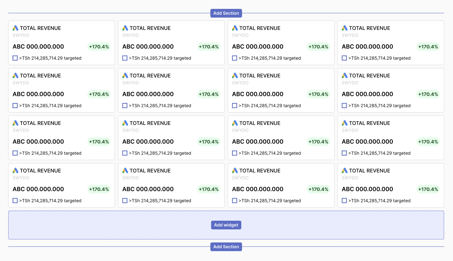
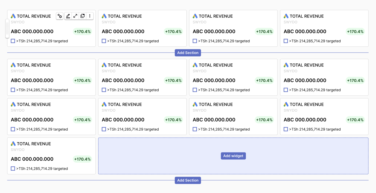
A first attempt was made by reusing Squarespace criteria of showing available spaces between rows in the report. I differentiate the buttons with "Add Sections" and simpler "Add +", but more for the action the user can take. With the first, the user can create a whole new Section in the report, which will be a group that contains widgets that cover the same topic. The Add + or Add widget, was intended to help users add elements to the section.
Here below is a selection of variants I created to highlight more the concept of adding widgets horizontally, but also showing the solution of how areas get active when highlighted.
After carefully reviewing with other designers the design solution and discussing it with the Product Manager, we agreed that the direction was correct, but we needed to simplify the button.
Therefore, I opted for an Add Button, more similar to the one in the previous widgets, but that was standing out of the areas of the widgets and was behaving more like the solution I was exploring.
FINAL SOLUTION AND UI DESIGN
As described above, the solution stood in showing an element that was more similar to the previous one, for several reasons. Customers were used to the Add Button but struggled with its position.
Here below I show multiple states of the report and the interaction with the Add Button.
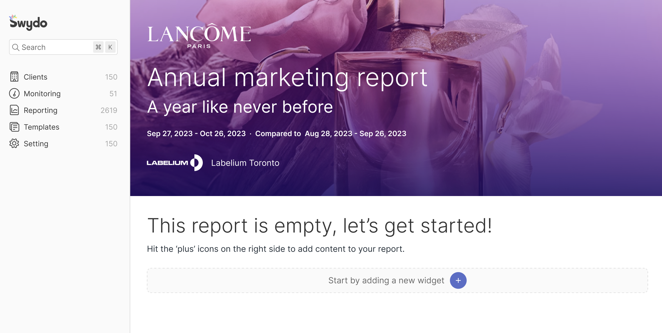
Horizontal add button
When the report is empty, the add a widget button will appear automatically underneath the empty report message. By clicking on the plus button, a submenu will show what options a user can add to the report.
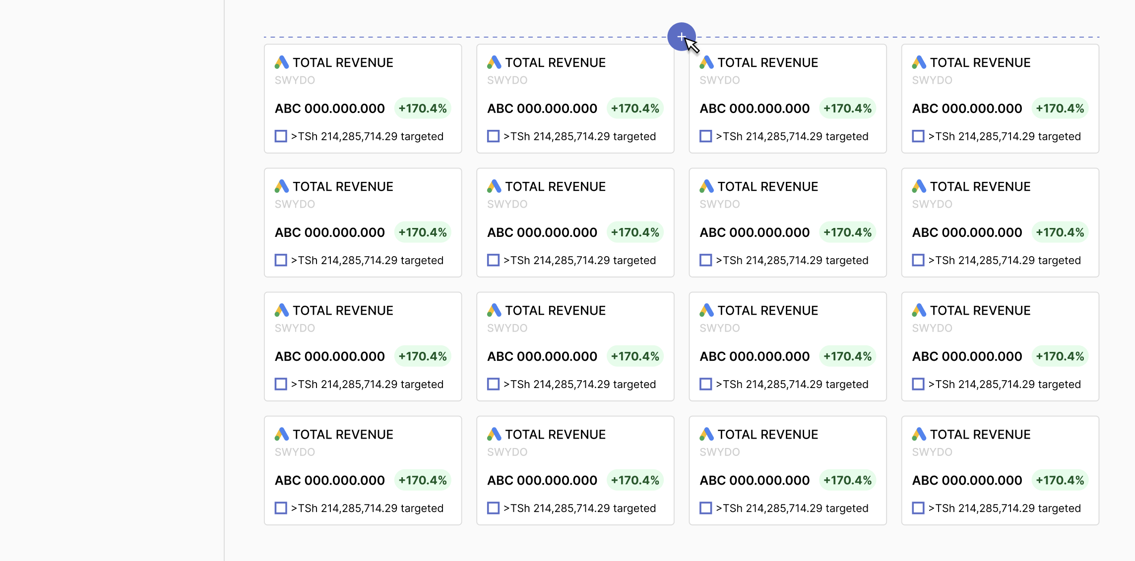
Horizontal gutter add button - TOP
If a user wants to add something at the top of the stack of widgets, they can do that by hovering the top gutter above the first row of widgets, so as to reach the plus button that will appear automatically. By clicking on the plus button, a submenu will show what options a user can add to the report. Once the user decides which widget will be added, this will be positioned in the first place of the row and will push the other widgets to the right or the row below, if the row is already full.
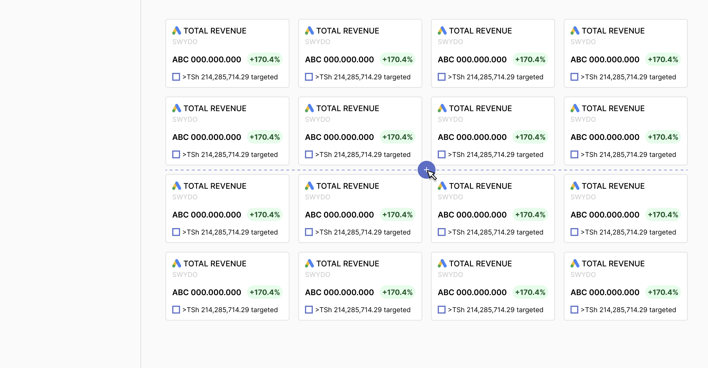
Horizontal gutter add button - IN BETWEEN
If a user wants to add something in between the widgets rows, they can do that by hovering the gutter between the rows of widgets, so as to reach the plus button that will appear automatically. By clicking on the plus button, a submenu will show what options a user can add to the report. Once the user decides which widget will be added, this will take the first place of the following row and will push the other widgets to the right or to the row below, if the row is already full.
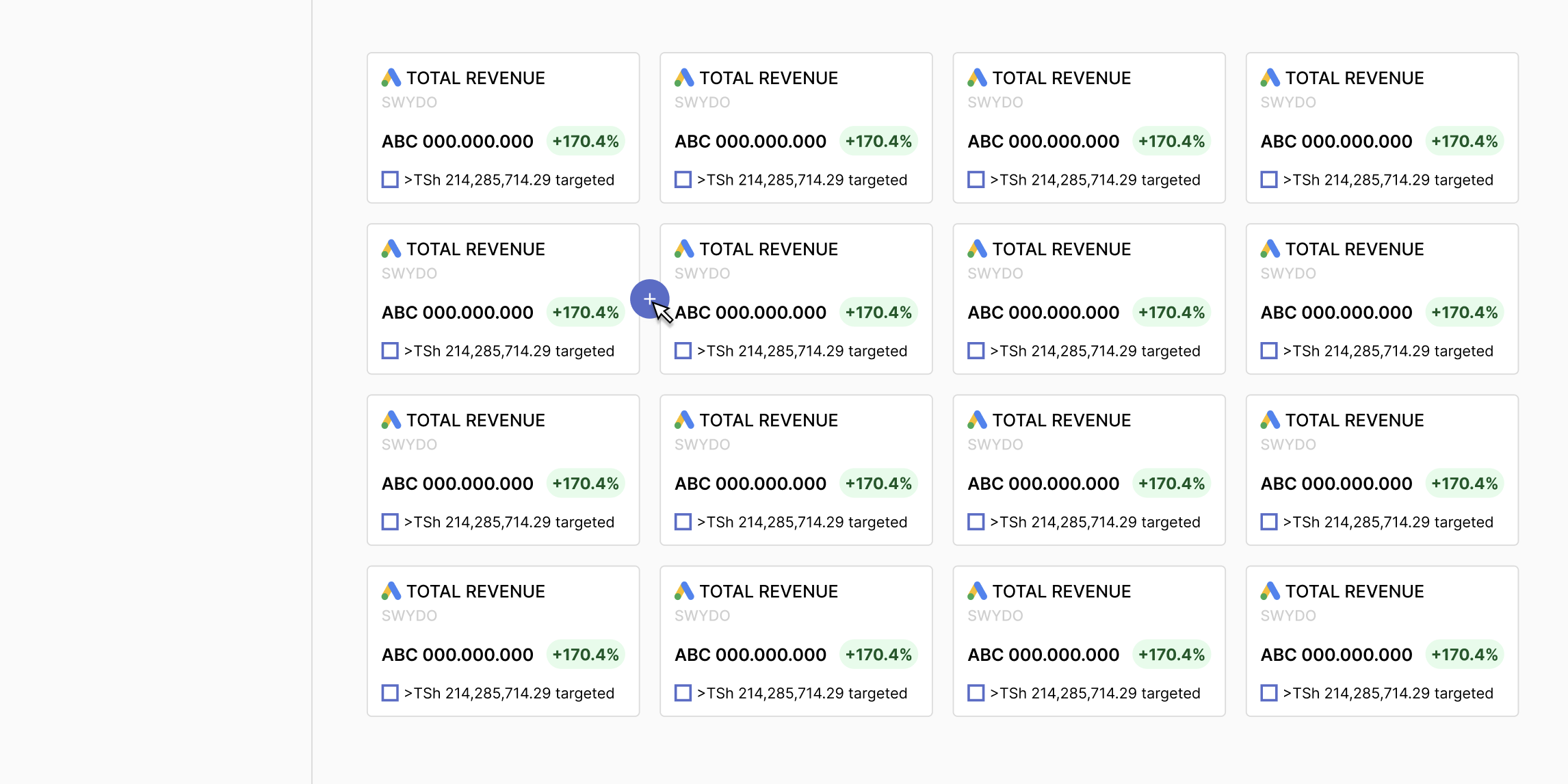
Vertical gutter add button
If a user wants to add something in between widgets in a row, they can do that by hovering the top gutter above the first row of widgets, so as to reach the plus button that will appear automatically. By clicking on the plus button, a submenu will show what options a user can add to the report. Once the user decides which widget will be added, this will be positioned on the first place of the row and will push the other widgets to the right or to the row below, if the row is already full.
EXTRA SOLUTION FOR LONG WIDGETS
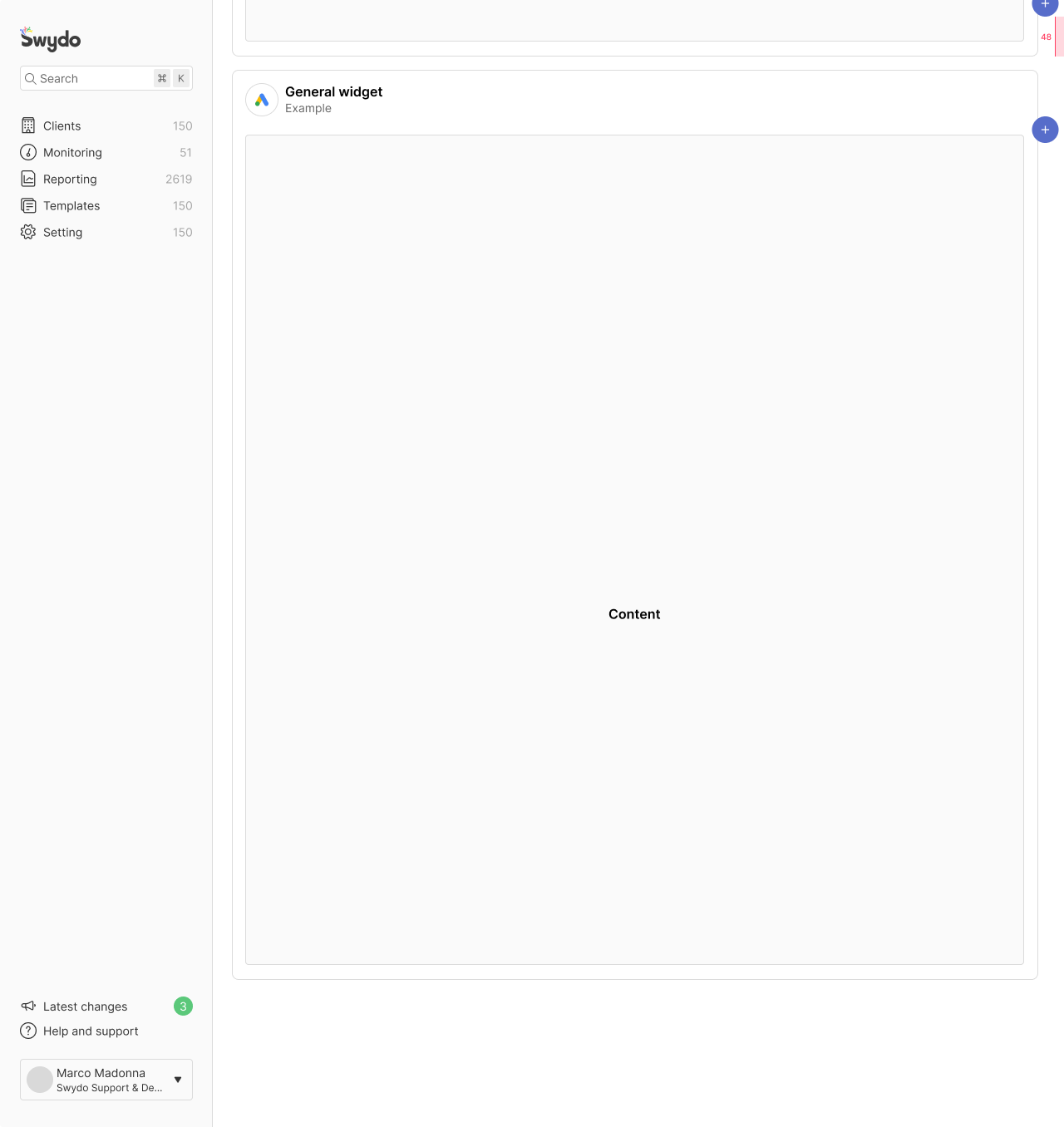
For high-height widgets, we can use a different solution for the plus button. Let's assume the plus button has a padding-top of 24px. The top margin of the plus button is anchored to the top of the widget. This remains anchored there until the top of the widget is visible in the report editor.
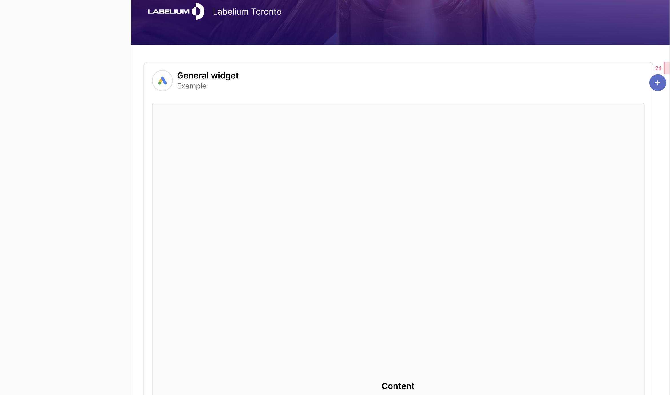
When scrolling, the plus button is still anchored to the top of the widget because the top of it is still in the report, and still has 24px padding to the top. As soon as the top side of the widget reaches a margin of 24px to the top of the report, the plus button remains anchored at 48px from the top.
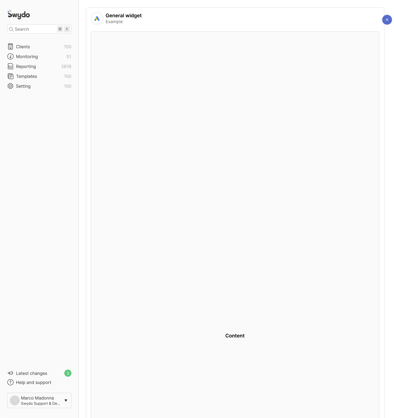
Example 1/3
As soon as the top side of the widget gets out of the report, the plus button remains anchored on the top and has a padding-top margin of 48px. It will remain in that position as long as we scroll to the bottom side of the widget.
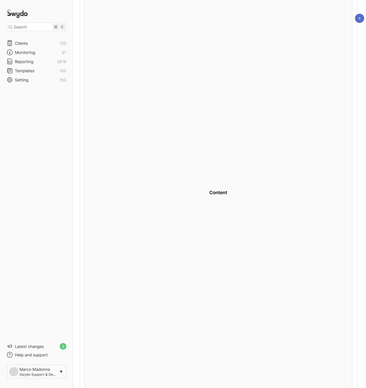
Example 2/3
As soon as the top side of the widget gets out of the report, the plus button remains anchored on the top and has a padding top margin of 48px. It remains in that position as long as we scroll to the bottom side of the widget.
Example 3/3
As in the previous slide, also here as soon as the top side of the widget gets out of the report, the plus button remains anchored on the top and has a padding top margin of 48px. It remains in that position as long as we scroll to the bottom side of the widget.
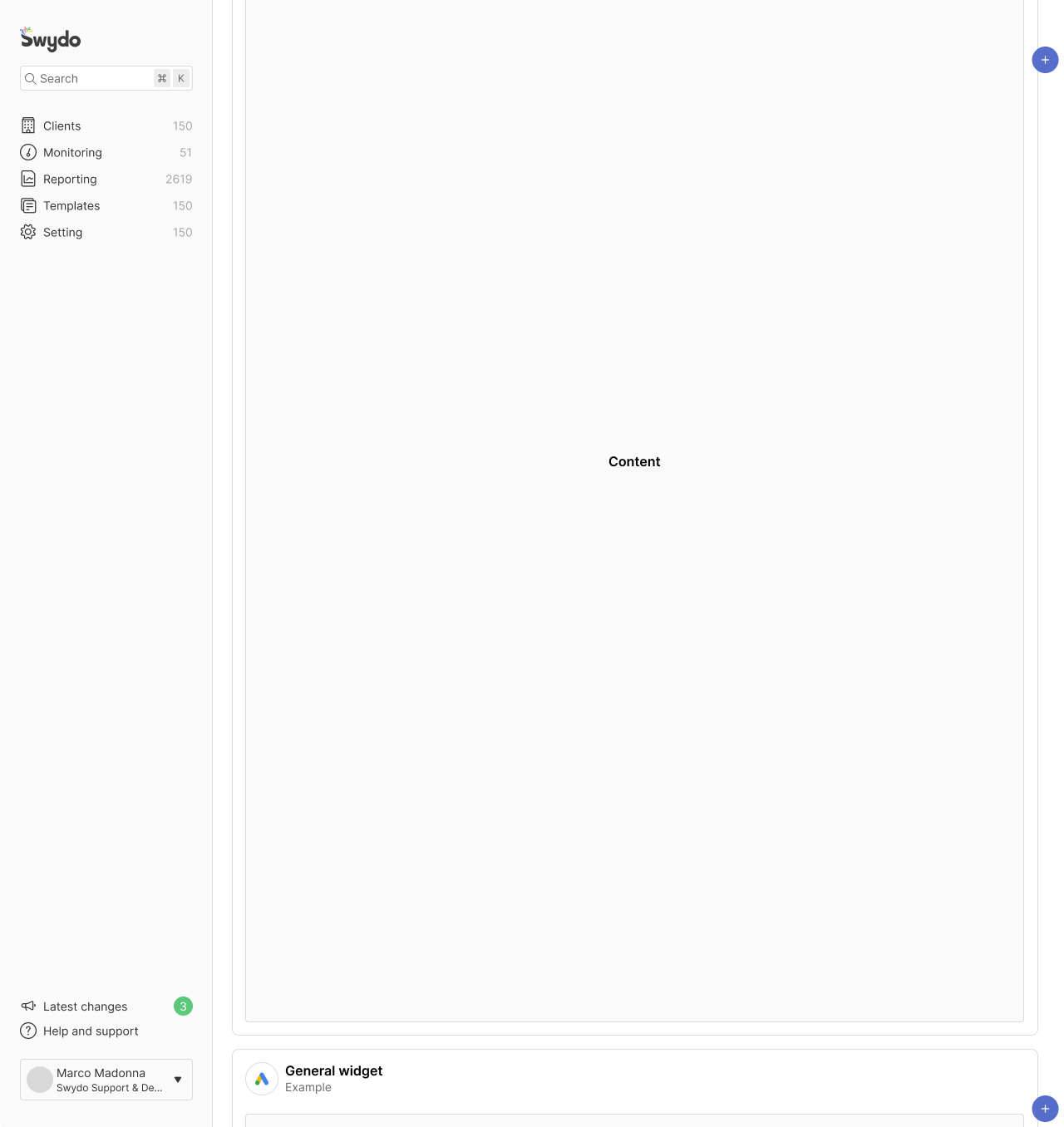
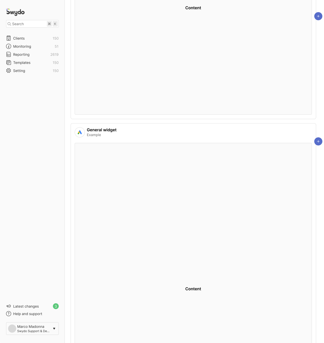
When the user scrolls until 128px till the end of the widget, so towards its bottom side, the plus button will have padding top and bottom of 48px.
From this limit, the plus button gets anchored to the bottom of the widget and starts following the scroll of the whole report.
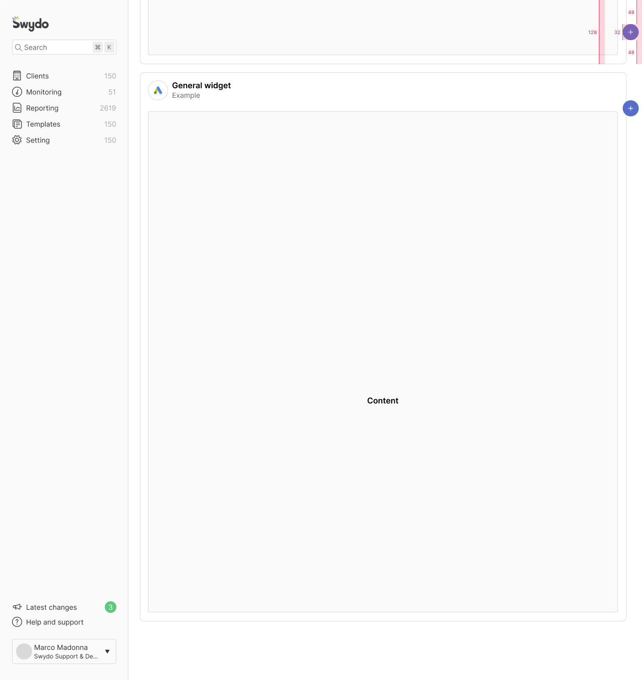
The plus button disappears while following the scroll because the padding-bottom is also 48px.