

DESIGN SYSTEM
RESTRUCTURE
Splitting Swydo's design system out of one Figma file into five that talk to each other, so people could work on it without waiting for each other.
INTRODUCTION
When I joined Swydo the design system was a single Figma file holding every component and asset the product used. It worked as an archive and failed as a tool: nobody could find anything, nothing could be reviewed in isolation, and any change meant opening the whole thing.
PROJECT
I split it into smaller files that reference each other: Foundations, Essentials, Compositions, Icons, Illustrations, following Atomic Design, with the company's brand and product principles as the thing they all sit on. Tokens live in Foundations, documented, so designers and developers argue about the same values.
CHALLENGE
Making the structure adoptable, not just tidier. Designers had to be able to branch a single component, change it and ask for review without touching the rest of the system, and developers had to be able to treat the documentation as the source of truth. A cleaner file nobody uses is worse than a messy one everybody does.
MY ROLE
I led the restructure as the team's Product Designer: auditing what existed, defining the new file structure and how components were categorised, documenting the foundations and tokens, and working with the developers until the new workflow stuck.
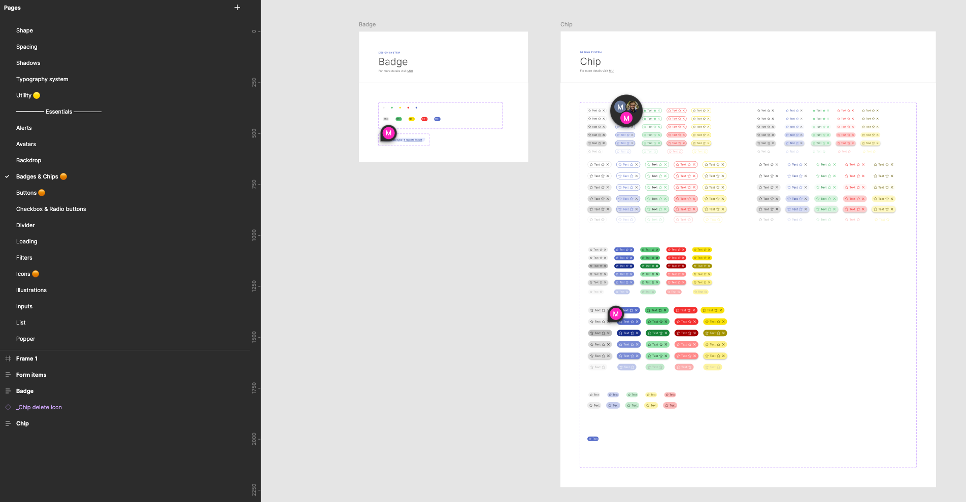
Below, the restructured system open in Figma. The page list on the left is the structure itself, Shape, Spacing, Shadows, Typography and Utility, then the Essentials divider and the components under it; on the canvas, the Badge and Chip documentation. The two cursors are the point: two people in the same file at the same time, on different components, without collisions.
NEW STRUCTURE
From previous experiences on Design System, the main goal was for me to split the design system into smaller files that communicate among them, making them lighter and easy to scan.
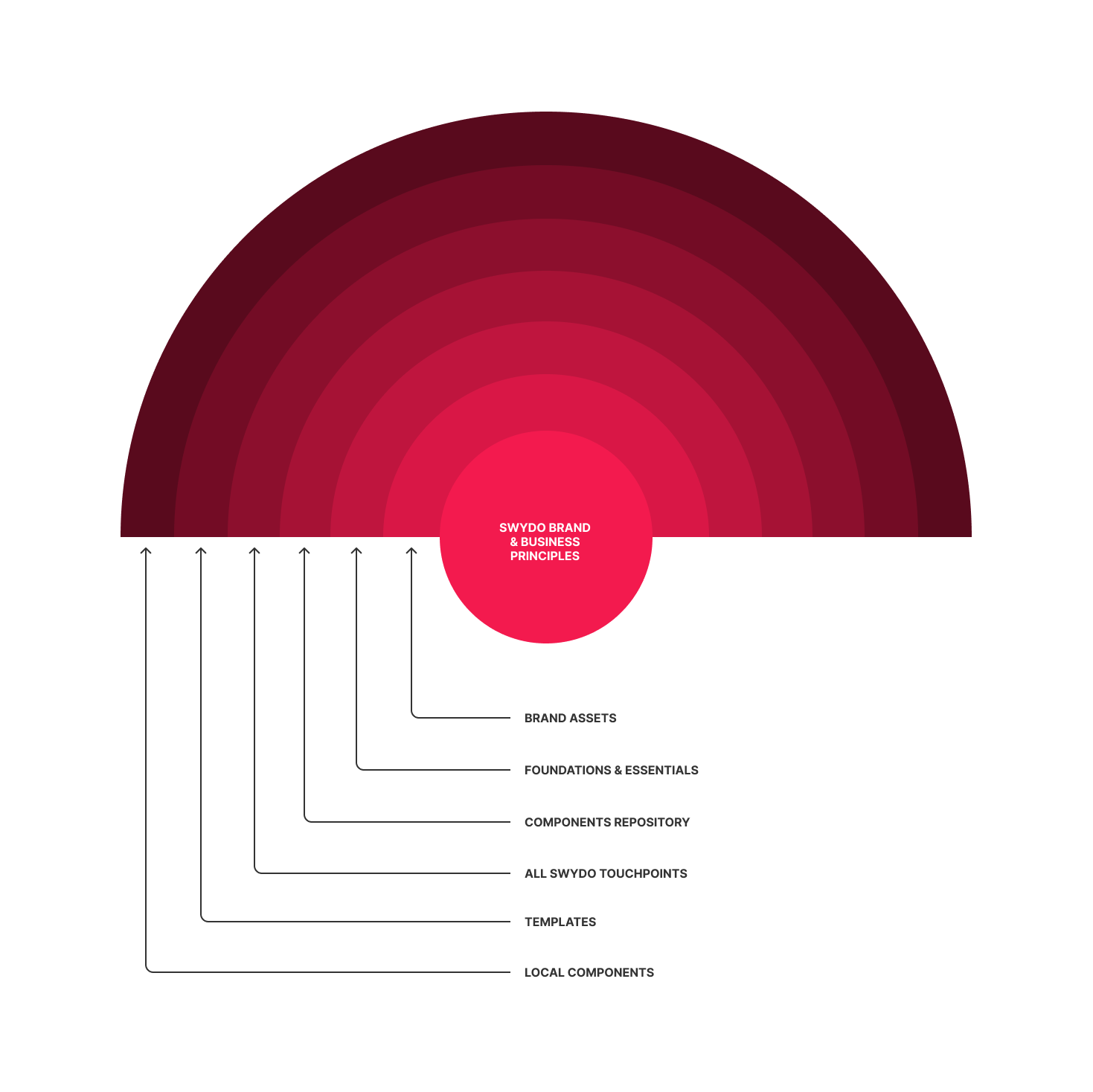
The first thing I did was identifying what was the core of the company, putting at the center of the project the company's principles, both for brand and business.
From there on, the graphic above wanted to show how from the core to the tangible assets, the organization of the assets could become a tool that allowed people in the company take their stake on the definition of every single step of the Design System creation, having the designers leading the project.
Here below, is a detailed flowchart of how these organizations of responsibilities and division of areas can unfold.
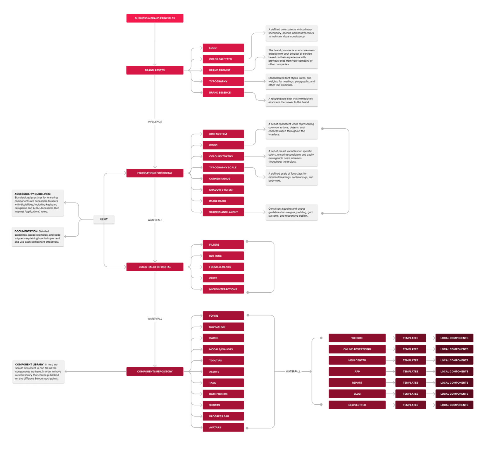
DESIGN SYSTEM - CATEGORIES SPLITTING
The first thing to do was the research on the components available. Once we identified the component's structure on the previous system, we classified the components following the Atomic Design fundamentals, dividing the assets into:
- Foundations
- Essentials
- Compositions
- Icons
- Illustrations
FOUNDATIONS
In the Foundations file, differently from the previous system, the idea is to work with Tokens, that, as commonly known, ease the conversation between designers and developers.
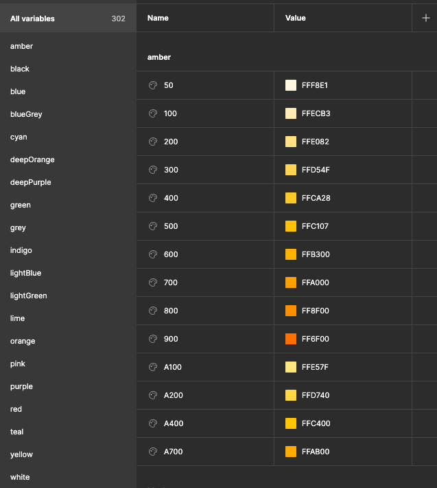
Primitive Colours
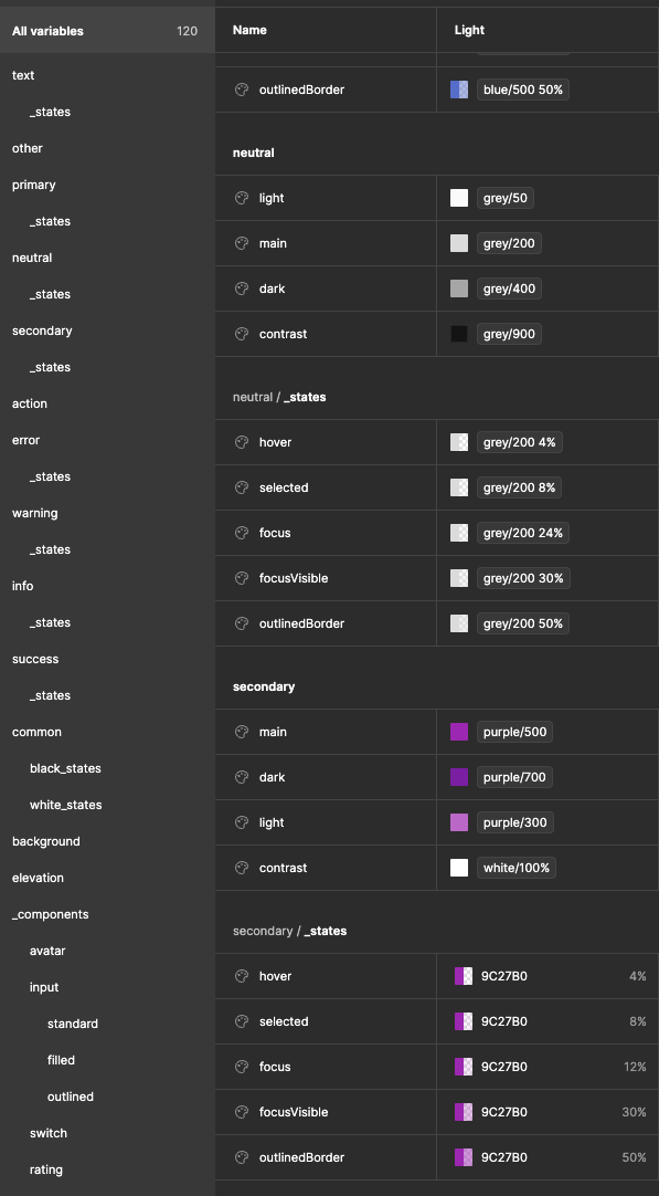
Colour Palette
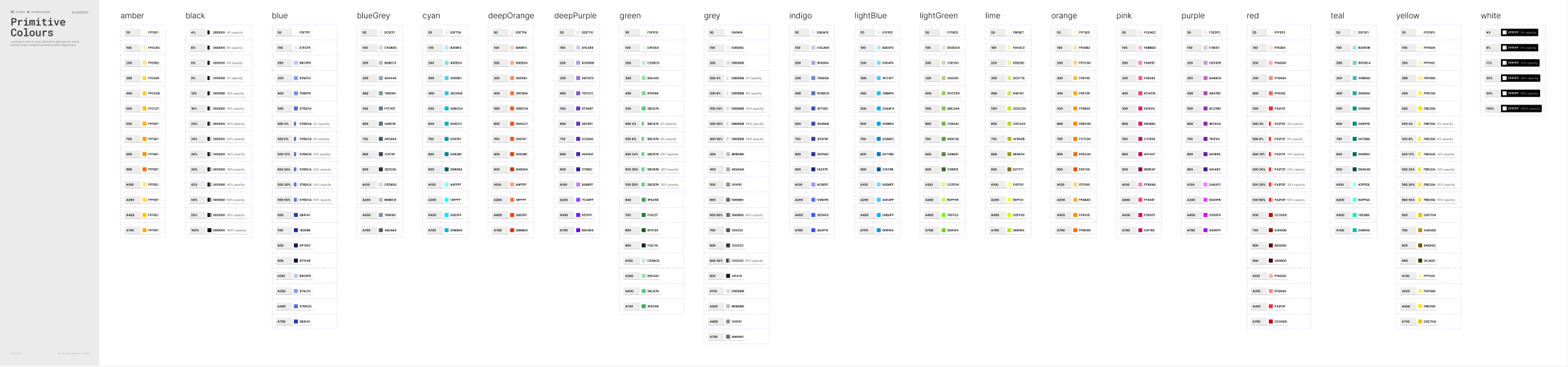
Once the tokens have been added to the documentation, I also created a more tangible version by designing some documentation in the Foundation file.
Here below an example for the Primitive Colours.
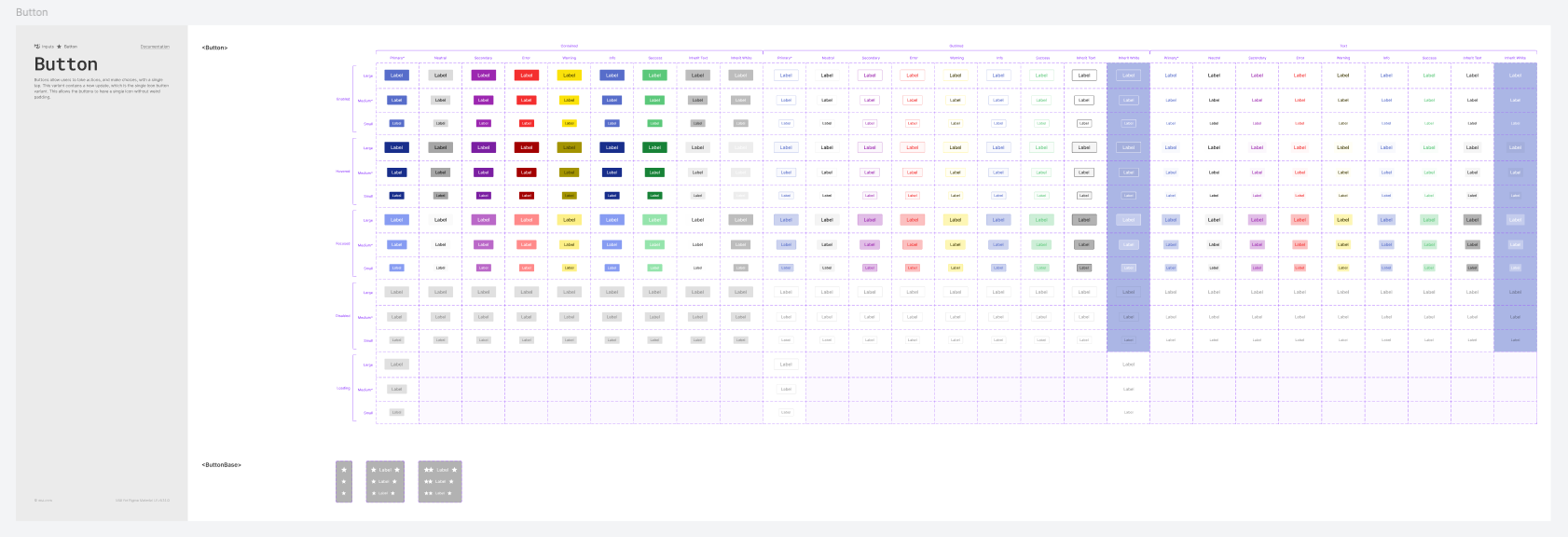
When it comes to components, the main idea is to locate in the Foundations file the elements that are not too complex in terms of construction and that will be relevant for the construction of other elements.
Here below an example of the Button component:
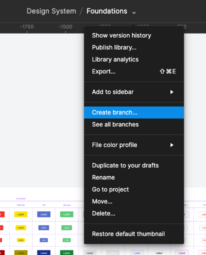
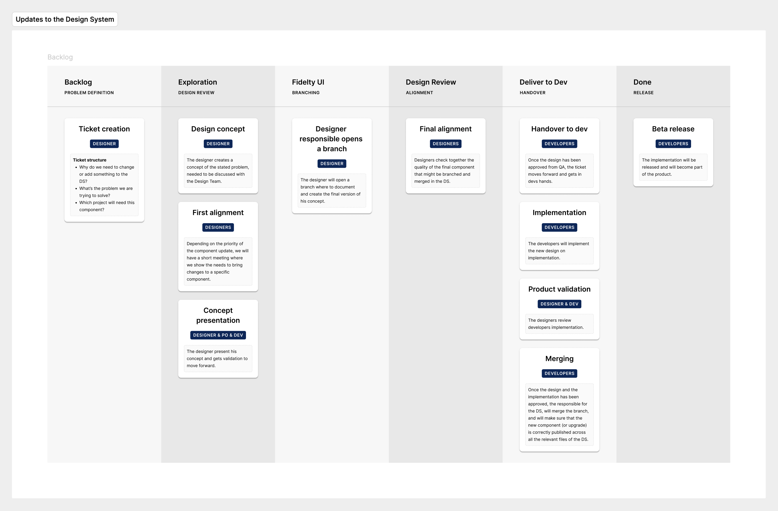
The benefit of having documentation divided with this criterion is that when there is the need to create a variant or change some settings in the current component, the designers can easily create a Branch and submit it to be supervised.
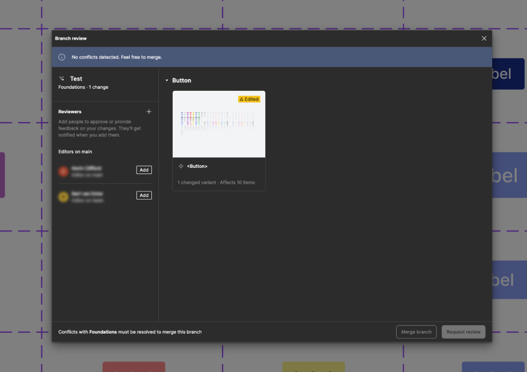
Once the work on the branch is over, the designer can request a review from other stakeholders who can leave comments, or merge the branch if there are no major issues.
ESSENTIALS
After the Foundation file, the Essential includes more complex components, or molecules, to follow the Atomic Design principles.
The idea is that components present at this level, are built with components coming from the Foundation file. An example could be the Button Group component.
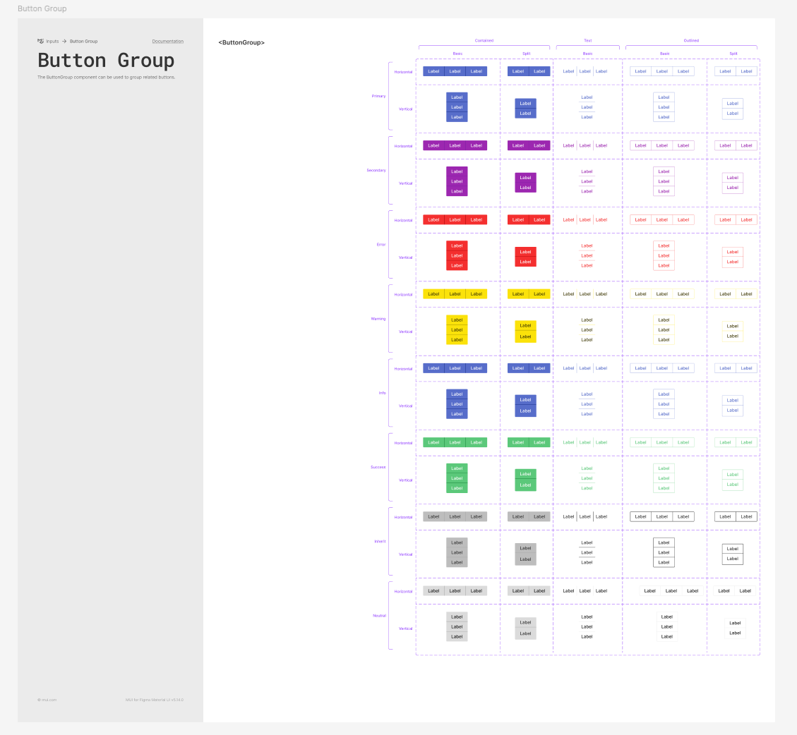
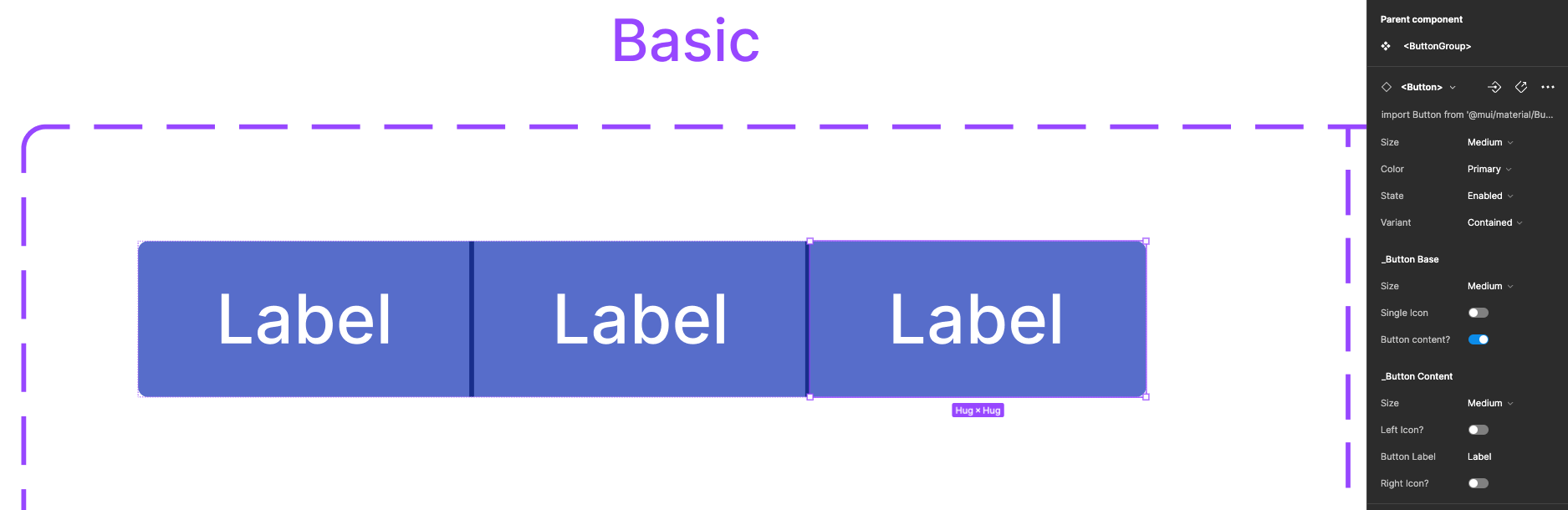
Above the documentation of the component, and below the structure of how the nested component is shown in the side toolbar.
The designer can either control the parent component or the nested component, as shown below.
COMPOSITIONS
The Composition file is the one that hosts all the bigger reusable components and more complex structured ones.
Here below I show how to approach the construction of a reusable component with the example of the Header.
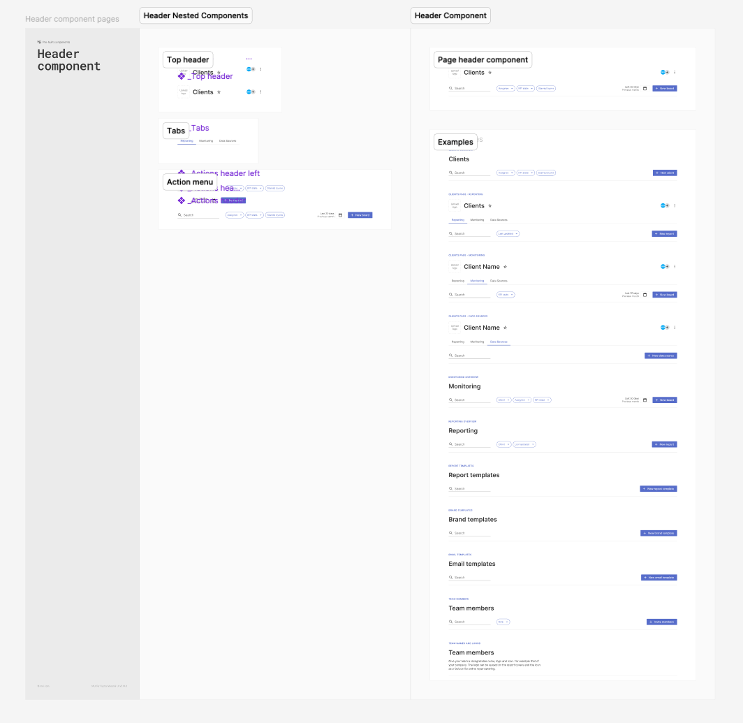
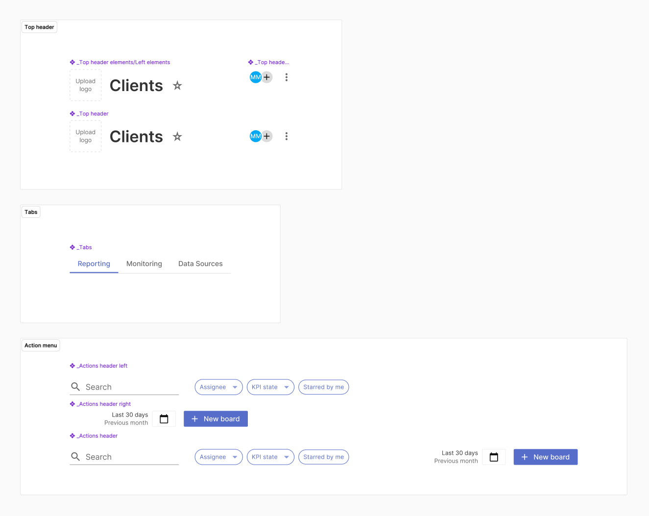
Here below a detail of how nested components are built.
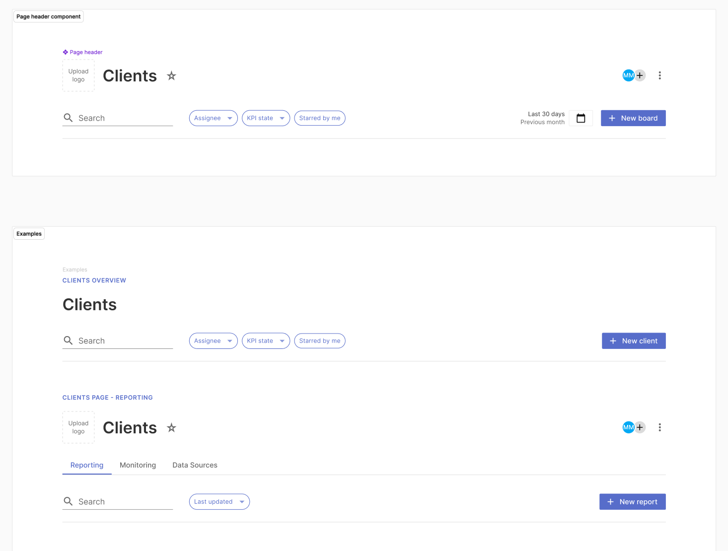
And this is how a more complex component will look like once it has been built and properly documented.
CONCLUSIONS AND AGREEMENT
These updates to the Design System helped to have seamless communication between designers and developers and facilitated the production of new features.
Every time a new component will have to be implemented or an existing component will need some changes, here below I defined a process to share on the designer's side, on how to approach possible integrations.