MIELE
Improving product guidance for new and old customers.
INTRODUCTION
The request was to optimize browsing & product guidance on the websites.
Just updating some category pages in the current journeys wasn’t going to solve some problems that emerged during a customer interview.
PROJECT
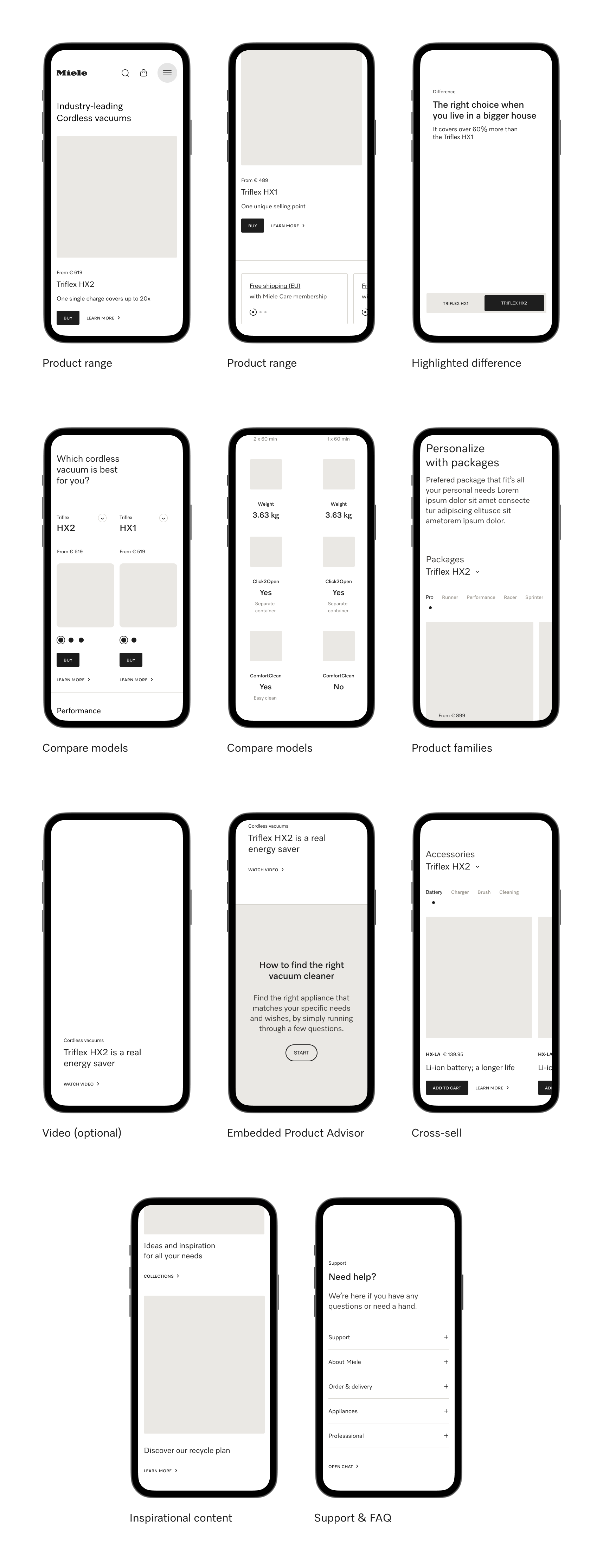
Create Sub-category pages to inform our customers and guide them through the category range. Change the PDP by showing the product range and highlighting specific features per variant.
CHALLENGE
We needed to restructure the main navigation & lead our customers to sub-category pages. Together with that, we needed to restructure the main navigation & lead our customers to sub-category pages.
MY ROLE
I was part of the project as a UI Designer and supported the UX Designer with the realization of high-fidelity wireframes.
USER EXPERIENCE
The product detail page is a crucial element in the online shopping experience
as it provides essential information about a product to potential customers.
A well-designed and comprehensive product detail page can significantly
influence customer trust, engagement, and ultimately drive conversions.
USER INTERFACE
AND COMPONENTS CREATIONS
The product list page plays a vital role in the online shopping journey
as it provides an organized and accessible overview of available products.
It allows customers to quickly browse and compare multiple options,
saving them time and effort.
MOBILE


DESKTOP

COMPONENTS
The cart page in e-commerce is where customers review, modify,
and finalize their selected items before purchasing.
It provides an overview of chosen products, allows changes,
and calculates total cost, streamlining the checkout process.
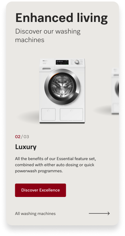
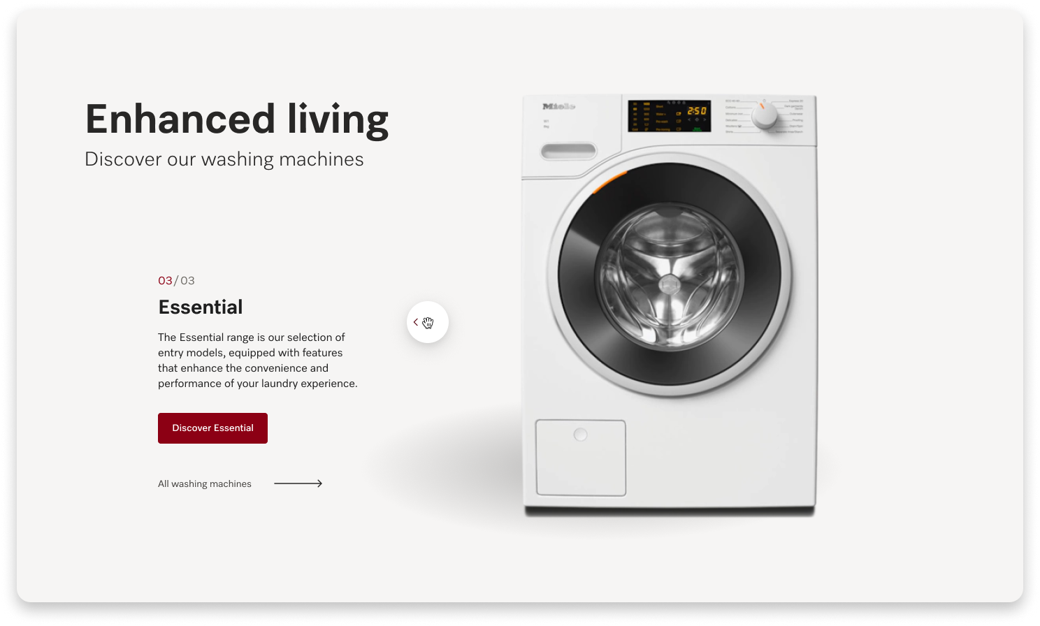
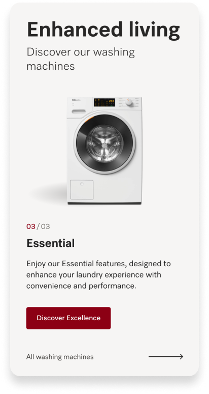
PRODUCT CAROUSEL
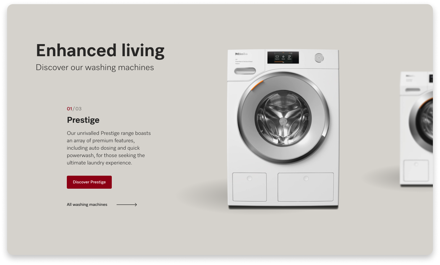
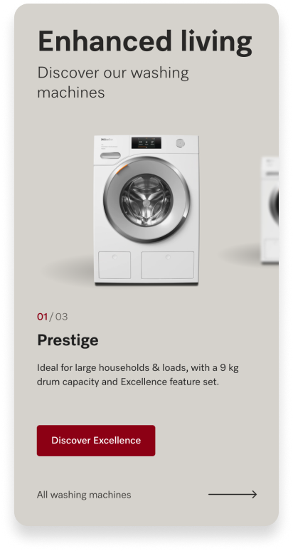
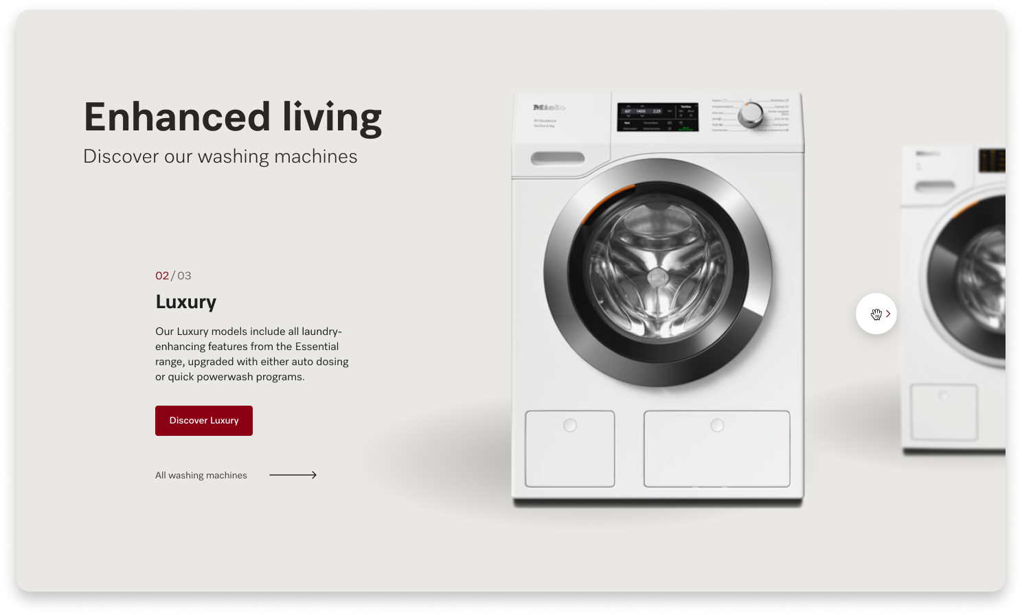
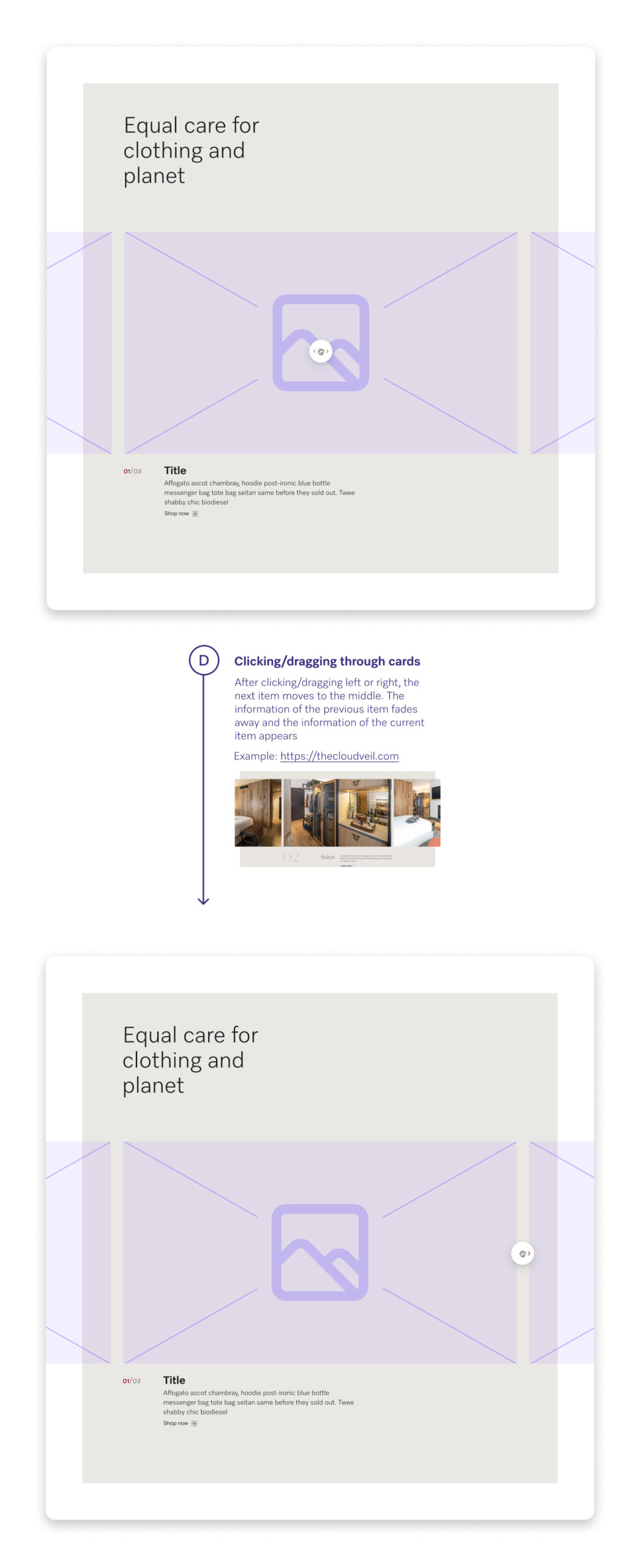
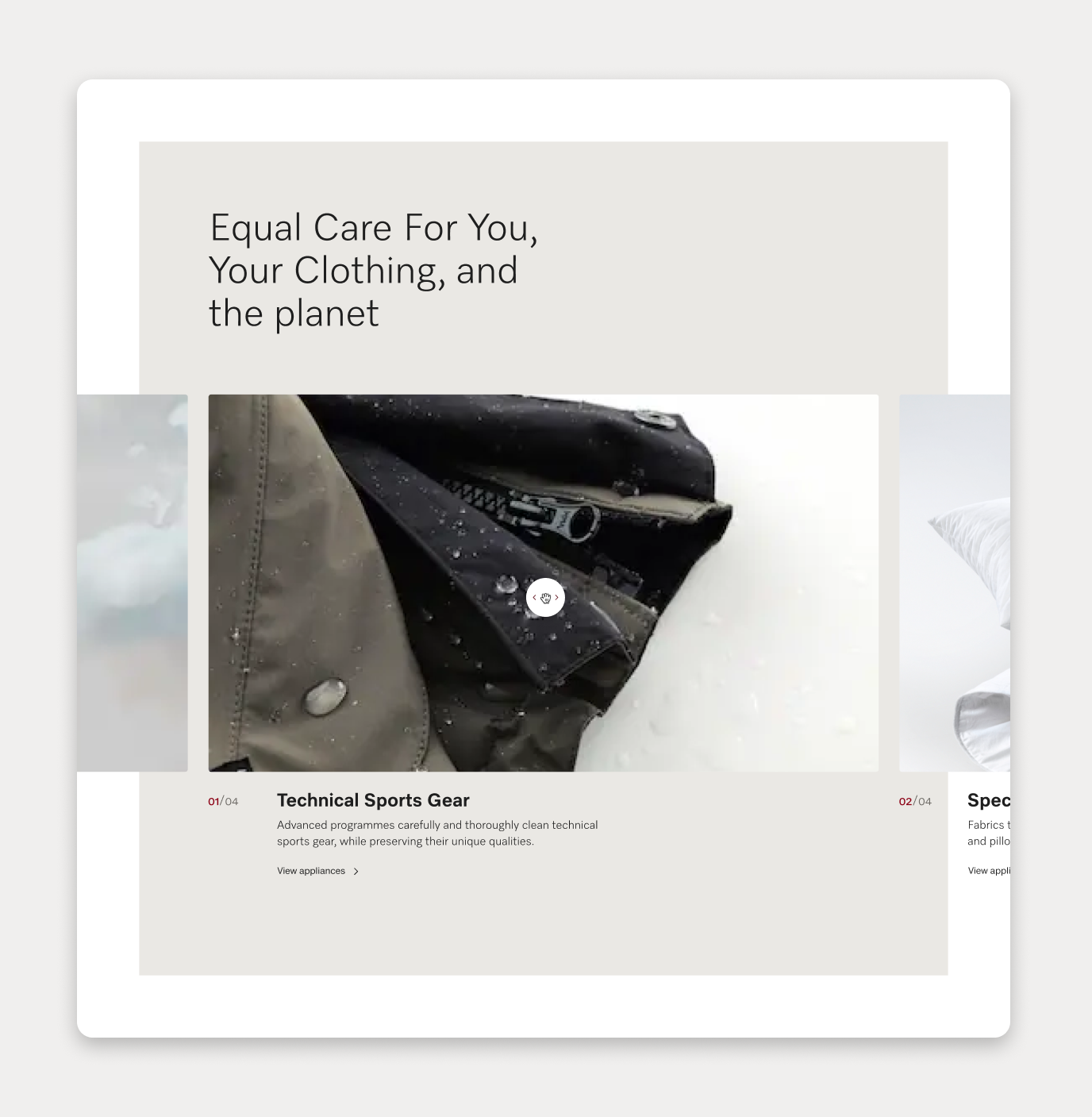
FEATURE CAROUSEL
GET IN TOUCH
PORTFOLIO 2025
© All rights reserved for the projects and content displayed.