

Size selector improvements
Intro
The old size selector feature displayed proportions relative to the entire report.
However, users often find it challenging to grasp the distinctions between available, selected, and unavailable options. They usually first click on unavailable options a couple of times and find out it's not available.
Here below how the size selector used to look.
Solution
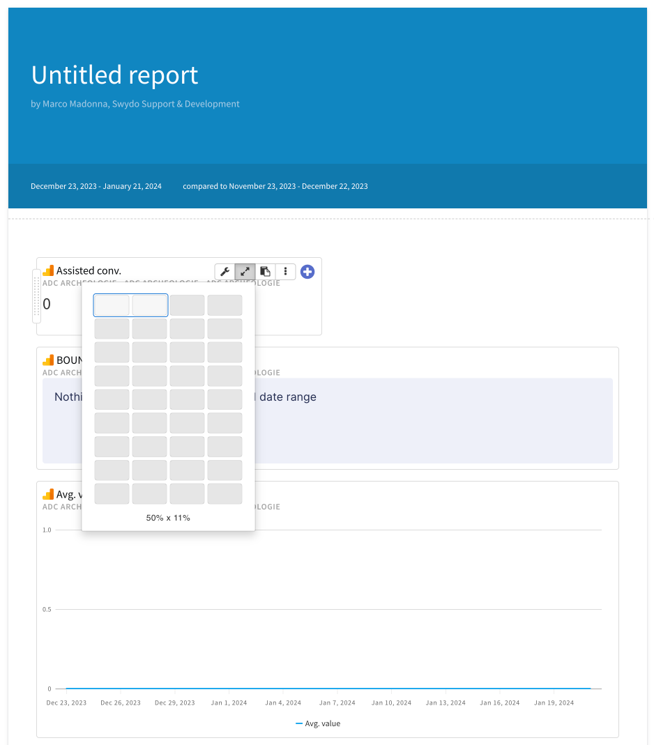
To make sure the users were able to identify the sizes of the widgets locally, the size selector widget adapts to the specific widget the user wants to add to the report.
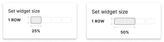
KPI size selector
Here, I wanted to display only one row, to limit the options of the height to a single row.
KPI widgets are not growing in height, but only in width.
However, the width also will be limited.
The only two options are 25% (so a single slot in the grid) and 50% (two slots). We disable the next two slots, showing them with the disabled grey from our color palette.
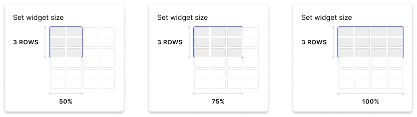
Charts except bar chart and heatmap
In the setup of the size selector, I only show 4 columns by 6 rows.
This is because the fixed widgets will only have 6 dimensions:
- 3 rows / 50% width (default size when opening the size selector);
- 3 rows / 75% width:
- 3 rows / 100% width;
- 6 rows / 50% width
- 6 rows / 75% width;
- 6 rows / 100% width;
When the user hovers over the following group of slots, the wrapper (a blue stroke that goes around the group of slots that shows the ratio of the widget) will include the slots that are part of that specific dimension. The wrapper is an element used to enhance what will be the widget ratio.
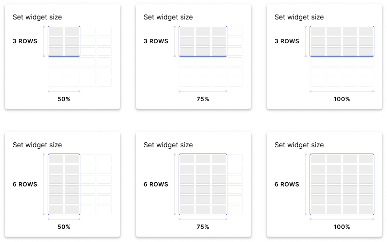
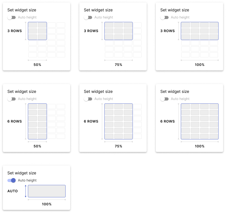
Bar Charts, Heat map, Table, Text widget
This variant is similar to the Chart one but differs from it because of the Auto height switch.
When triggering this switch, we automatically set up the size of the widget to a 100% width and an automatic height, that will resize according to the content we put in.
We still show the 6 fixed dimensions we have:
- 3 rows / 50% width (default size when opening the size selector);
- 3 rows / 75% width:
- 3 rows / 100% width;
- 6 rows / 50% width
- 6 rows / 75% width;
- 6 rows / 100% width;
If one of these dimensions is selected, the content within the widget will become scrollable.
When the user triggers the auto height, we show the following dimensions:
- Automatic height / 100% width
If this dimension is selected, the content will determine the height.