

KPI Review
Intro
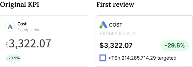
The first review of the KPIs took into account the setup of the KPIs that were already developed.
The relevant changes were then looked into aligning the main information into the visual of the KPIs and adding a border on the sides, with a slight corner radius that aimed to give a better feeling to the whole report.
The main trend badge was placed next to the KPI information and the target was placed below. The main information displayed all the numbers related to that value.
New review and design
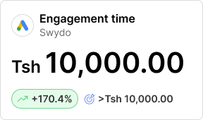
This KPI review aims to bring the main KPI information to stand out more at first look. The font-size has been increased and the amount of digits is limited. Above that amount, the number contracts and shows units at the end of the number.
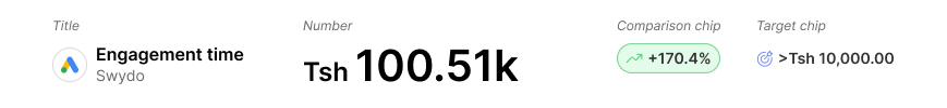
KPI elements
The elements in the component remain the same, there is only a format change in each one of them.
Title The logo is boxed in a circle with a stroke. The title of the widget uses lower caps, and the name of the integration as well, with a lighter grey.
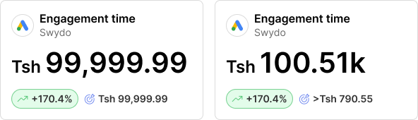
Number The number is now split into two versions: Standard, when we can display the currency and the whole number; Compact, which shows 3 significant numbers with 1 decimal place (take “Tsh 89000.55B” as an example).
Comparison chip
This is now a little bigger and colours have changed.
*This component will change eventually, for now, we can look into the chips on Tulip.
Target chip The chip for the target also slightly changes. Bolder font and the same amount of digits as per the new number setup.
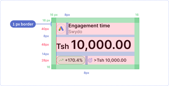
Component anatomy
A few things changed in the new KPI. The top title will have a different area for the integration logo and the style for the Title and subtitle also be changed. The chips will have an increment in size, both for the structure and for the font. They will be placed one next to the other and left-aligned.
Number contraction
The size limit for the number in their space is 7 digits plus commas and decimals dots plus currency value. When the digits in the number exceed that limit, the number contracts and the unit appears at the right end of it.
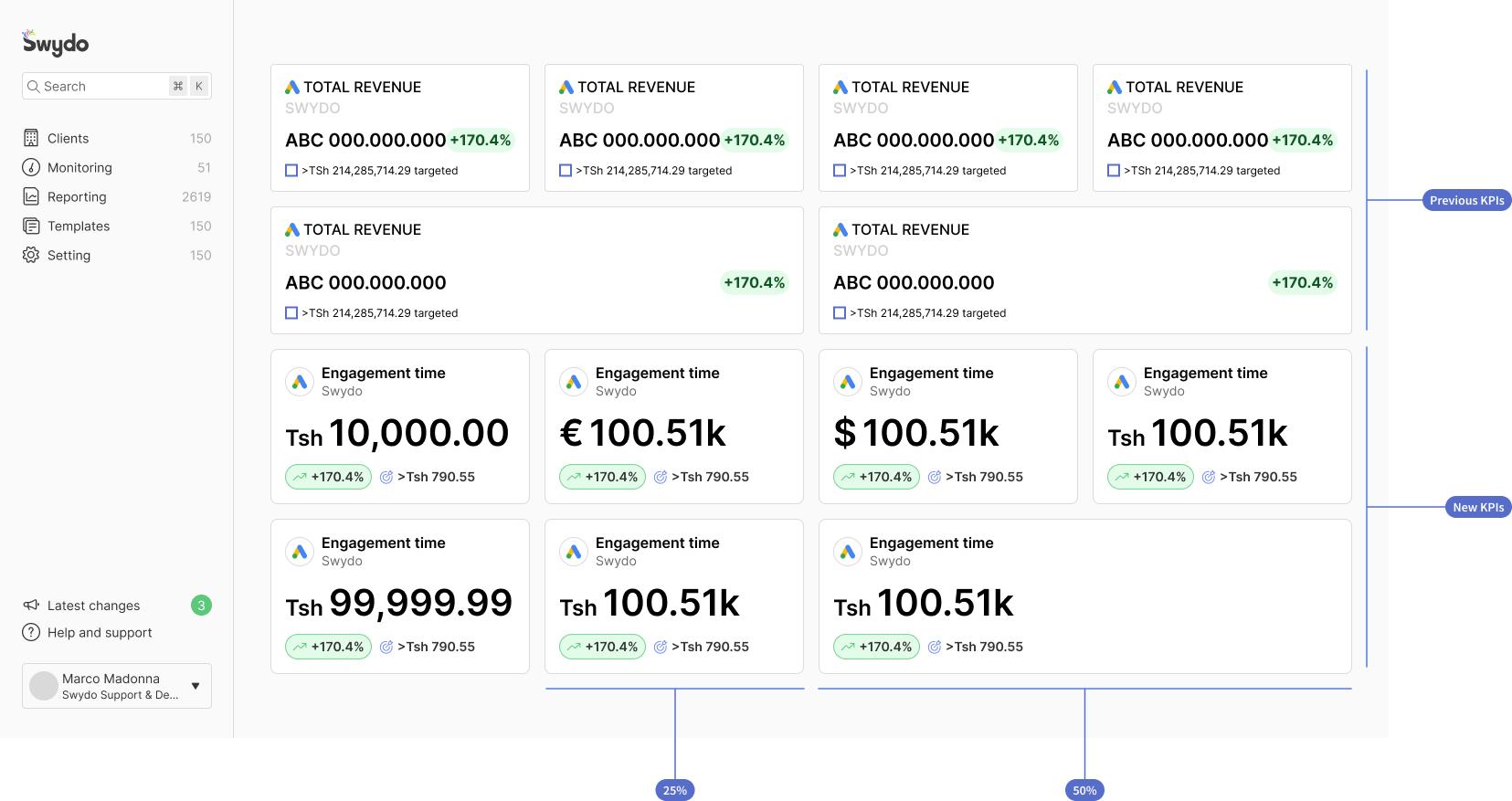
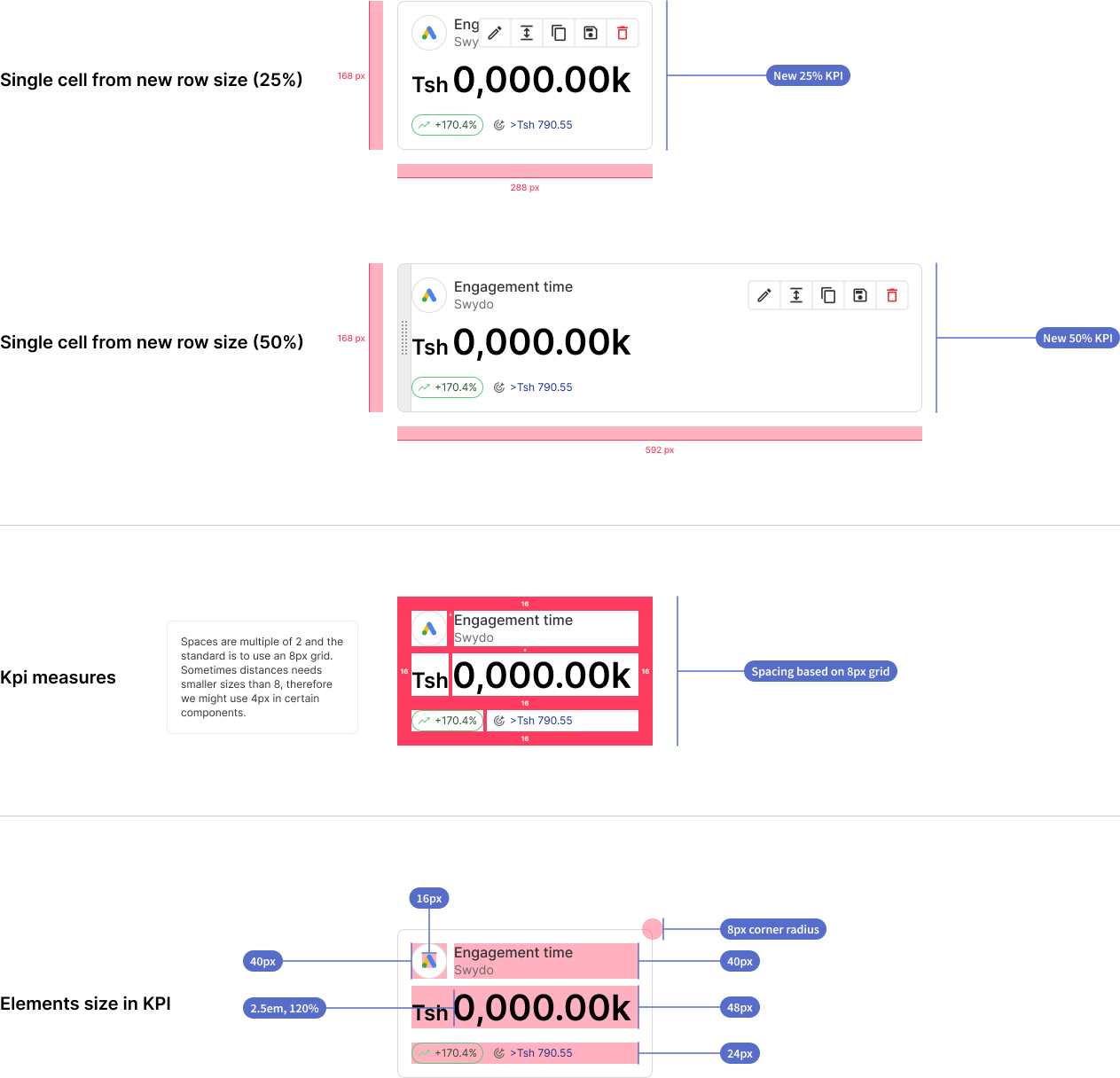
KPI size
As previously defined earlier, we have a new height for the KPI.
This will further define the sizes for all the widgets because it will impact the sizes of the rows in our report.
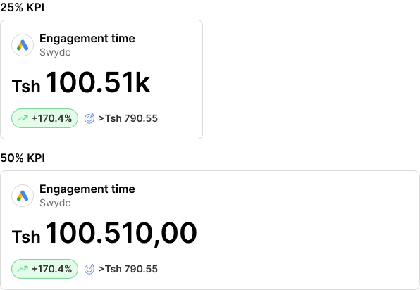
As for what concerns the horizontal space, we also previously defined column space. KPIs will always have 2 main sizes, 25% and 50%.
The comparison chip and the target chip will be stacked under the main KPI number and will remain aligned to the left side of the KPI even when this will be adapted to the 50% size. When on 50% the number will show up completely and not compressed.
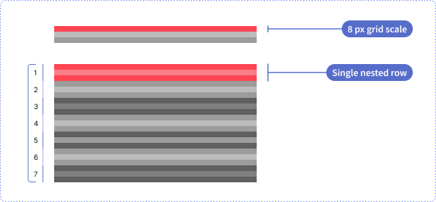
Grid and KPI structure detail
To have a KPI element based on an 8px grid, I had to check together with developers what solution to implement for the grid. The original row was based on decimal numbers, which didn't provide spaces based on a rigorous 8px grid.
The grid is built with 4 columns and 9 rows. Each row is composed of 7 nested rows, and each one of them has three lines of height of 8px. The final single cell size will be 168px by 288px, perfectly based on an 8px grid.
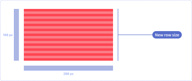
With the new setup of the rows and grid i also defined a set of sizes for the new setup of the KPI widget.
KPI examples
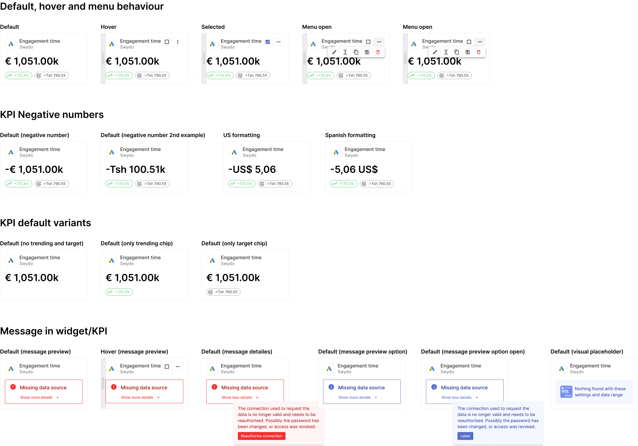
With the new KPI, also new states come in. Here below is an overview of all the most common statuses of the KPI.